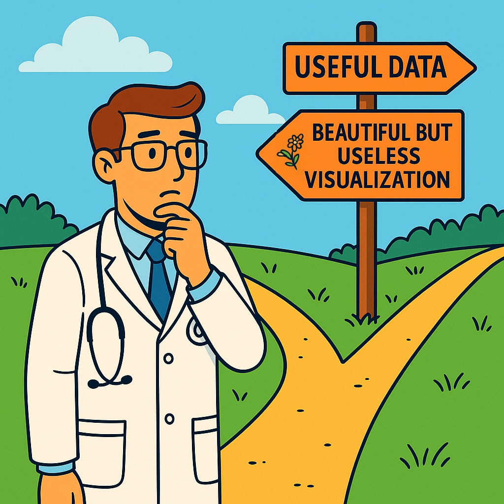
One thing I’ve learned:
🧠 A beautiful dashboard ≠ a useful one.
In healthcare, we don’t design for aesthetics — we design for action.
The best dashboards?
📈 The ones doctors open on their own, without reminders.
Here’s what I’ve seen work:
✅ Clinically relevant, actionable metrics — not just reporting KPIs
✅ Co-designed with clinicians, not handed off afterward
✅ One clear insight > five semi-useful charts
✅ Context is everything — trends need benchmarks or targets
What doesn’t help:
❌ Vanity metrics
❌ Complex visuals with no clear next step
❌ Numbers no one can act on
The goal isn’t to impress — it’s to support real decisions in real workflows.
If a dashboard doesn’t change behavior or spark a clinical question — is it really working?
🔄 Still learning how to build tools that matter — and staying curious along the way.
Exploring healthcare data too? Let’s connect — or share your take.

